
New feature – buttons size and corner radius
Our new feature can help you customize your buttons' size and corner radius for a sleek, modern look in your Instagram widget for your website.
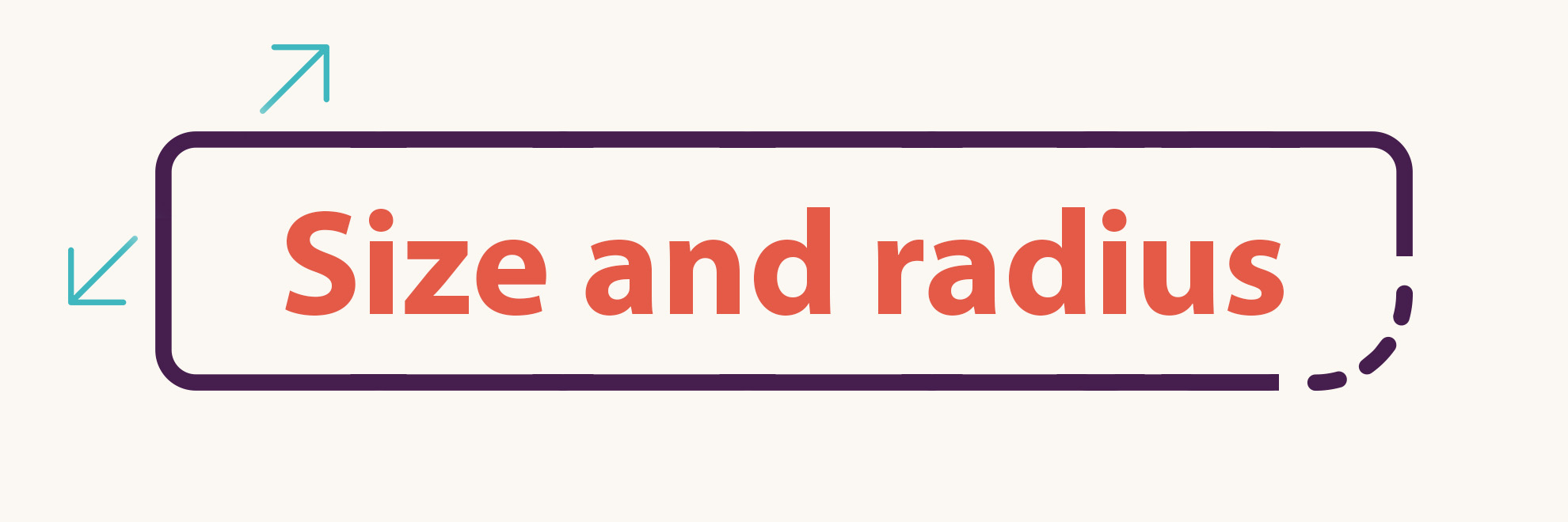
The new button styles
In the Buttons section, four new controls allow changing the size of the buttons and adding or removing the border-radius from these clickable elements.
You can control the size of the follow and load more post buttons and the slider navigation buttons separately. They do not need to have the same styling. These features are available both in our free and upgraded widgets.
To change the look of the buttons in the header or footer:
- Create or edit a new Instagram feed widget.
- Expand the Header section and enable the Show header option. Ensure that Follow button in the Header elements is active. Alternatively, expand the Footer section, enable the Show footer option, and select at least one feature in the Footer buttons. It will display the button element in the widget preview so you can see the adjustments live.
- Expand the Buttons section.
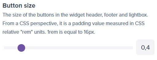
- Change the value in the Button size option to control the button size. It is the padding value in the REM unit.
- Adjust the value in the Button corner radius to adjust how round the button will be. 0 will give you a square design. Everything above 0 will start making the element round.
Slider navigation arrows
As mentioned previously, the styles of the navigation arrows are adjustable separately from the primary CTA buttons. In addition, we also added the option to set the color of the border of the slider navigation arrows. Previously it was possible only to change the border color of the CTA buttons. Right now, you can also adjust the colors of the slider buttons. You can control the normal state as well as the hover state separately.
To change slider navigation button styles:
- Expand the Layout section and set the Posts layout to Slider.
- Expand the Slider options section. Set either to Visible or Visible on hover.
- Expand the Buttons section.
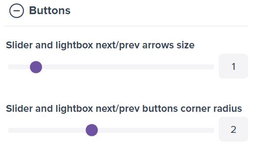
- Adjust the Slider and lightbox next/prev arrows size option to change the size of the buttons that control the slider.
- Slider and lightbox next/prev buttons corner radius option can change how round the corners of the slider navigation controls should be.
- With Slider and lightbox next/prev buttons border color, you can change the colors of the button’s border. By default, it is fully transparent.
- The Slider and lightbox next/prev buttons border color on hover controls the color of the slider navigation buttons when the user puts a mouse cursor over these elements.
Comments (0)
You must be logged in to post comments.