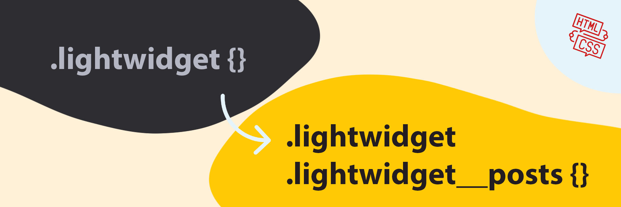
Class names update
We have updated the class names used in the HTML of our plugin. Learn about these changes and how they might impact your website and widget.
Reasons for the change
We plan to add some new options to our widgets. They will require additional HTML elements. The previous HTML code structure had some limitations. We changed the layout to make adding new features more manageable and keep the code semantic.
In the CSS code of our widgets, we use the BEM methodology. The classes’ naming also changes as the HTML code’s structure changes. We wanted to maintain the same naming standard everywhere.
This article will be necessary for users using our Custom CSS feature. We had to update the HTML structure of the widgets as well as rename some of the classes.
HTML code changes
An additional <div> tag now wraps the <ul> tag.
HTML structure before the changes:
<ul class="lightwidget">

    <!-- list with posts -->
</ul>
HTML structure after the changes:
<div class="lightwidget">

    <ul class="lightwidget__posts">

        <!-- list with posts -->

    </ul>
</div>
New class names
If you’re using our plugin on your website or application, you may need to change your Custom CSS code to accommodate the new class names. These changes will ensure that your website continues functioning as expected with our plugin’s latest version.
Mainly the block modifiers have changed. Below is a table showing the names of the classes before and after.
In most cases, the current code in Custom CSS should work fine. If there is any problem, please update the class names in the Custom CSS field according to the table.
| Before | After |
|---|---|
.lightwidget--grid |
.lightwidget__posts--grid |
.lightwidget--slideshow |
.lightwidget__posts--slideshow |
.lightwidget--columns |
.lightwidget__posts--columns |
.lightwidget--captions |
.lightwidget__posts--captions |
.lightwidget--click-event-none |
.lightwidget__posts--click-event-none |
.lightwidget--hover-zoom-in |
.lightwidget__posts--hover-zoom-in |
.lightwidget--hover-caption-slide-up |
.lightwidget__posts--hover-caption-slide-up |
.lightwidget--hover-fade-in |
.lightwidget__posts--hover-fade-in |
.lightwidget--hover-fade-out |
.lightwidget__posts--hover-fade-out |
.lightwidget--hover-likes-comments |
.lightwidget__posts--hover-likes-comments |
.lightwidget--hover-show-icon |
.lightwidget__posts--hover-show-icon |
.lightwidget--hover-show-instagram-icon |
.lightwidget__posts--hover-show-instagram-icon |
.lightwidget--zoom-out |
.lightwidget__posts--zoom-out |
.lightwidget--hover-zoom-rotate |
.lightwidget__posts--hover-zoom-rotate |
.lightwidget--image-format-square |
.lightwidget__posts--image-format-square |
.lightwidget--image-format-original |
.lightwidget__posts--image-format-original |
.lightwidget--object-fit-fallback |
.lightwidget__posts--object-fit-fallback |
.lightwidget--hide-tiles |
.lightwidget__posts--hide-tiles |
.lightwidget--grid-{number} |
.lightwidget__posts--grid-{number} |
.lightwidget--columns-{number} |
.lightwidget__posts--columns-{number} |
.lightwidget |
.lightwidget__posts |
To modify the class names in your Custom CSS code:
- Edit your widget settings.
- Expand the Advanced section.
- Modify the selectors in the Custom CSS code according to the table above.
Comments (0)
You must be logged in to post comments.